New Brand Image
Reveal of the new Uteco’s image: The era of the flex-converting is here.
For over 35 years, Uteco has been successfully proposing itself to the converting market, where we are considered a leader with reliable and quality products. Uteco's people are the backbone of the company, globally recognized for their ability, passion and dedication.
In a constantly evolving market that determines new trends year after year, Uteco must anticipate and then face every possible challenge, in particular those imposed by the climate and environmental crisis. The rapid transformation involves the entire packaging sector making it essential for Uteco to react proactively by presenting a clear vision and assisting customers with efficiency in terms of digitalization, productivity and attention to sustainability.
This is the starting point for the future we want to continue building together, here at Uteco. For this reason, we have decided to renew our corporate image with a more elegant, contemporary and minimalist logo but without forgetting our own roots.
Discover our new Corporate Brand Identity: The era of the flex-converting is…
Striving to maintain a connection with our iconic brand was one of the main objectives of the project; the new corporate image had to satisfy all existing expectations regarding what our historical brand represented and at the same time accompany Uteco towards new goals.
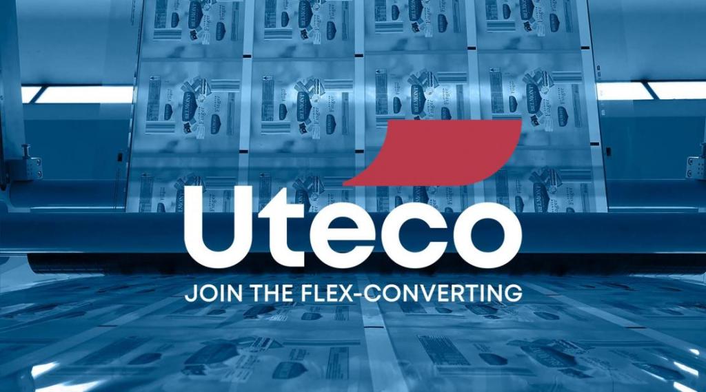
The key element of the new logo is the red accent, taken from the helical ribbon of the previous logo, resized and declined in an easier recognizable graphic element. The accent has a distinctive color, a Roman red that binds us to the Italian tradition thanks to the passion and willpower of the people who helped build the company. Finally, the sign has a positioning that is anything but casual, focusing attention on the final part of the word Uteco, "eco", to indicate the commitment of the whole company towards a more sustainable future.
In the word "Uteco", the cold neutrality of the gray color is abandoned to make room for a warmer tone of blue, a color that wants to communicate not only reliability, but also trust and loyalty of the company towards its customers.
The color provides a strong visual link to our brand: the consistent representation of these colors helps to reinforce the distinctive character of the Uteco brand.
The logo is now more modern, clear and simple, reduced to its essential elements and presented with a new design. Combining elements of the past with features of modernity, the logo represents the company's ability to build on deep roots, to design a future made of dynamism and innovation. These are the values Uteco wants to transfer into its new image: sustainability, innovation, results, cooperation and passion. This is the perfect representation of Uteco: a group of agile professionals who aim to build new positive paths for the future of the company and the converting market.
For this reason, today we invite you to join us under the sign of flexible converting, as expressed by our new payoff: “Join the Flex-Converting”. It is not just a slogan, but above all a challenge – to ourselves and to the market – to differentiate our brand from the competition.
We thank you for your continued support and valuable collaboration and hope you will stay tuned for what’s coming next!